

Contents:
- Add color to your org chart
- Edit your colors and palette
- Use color to view compensation and headcount by department
Add color to your organizational chart
In this section:
- Color a position
- Color a position using the people & positions table
- Color a branch of your org chart
- Color a group
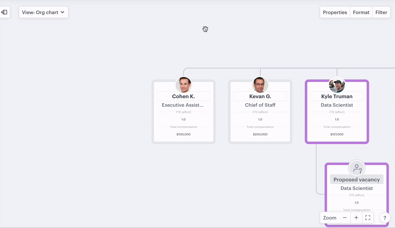
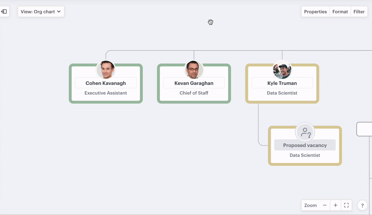
Color a position on your org chart
- Click the ellipsis on any position
- Select "color"
- Choose a color
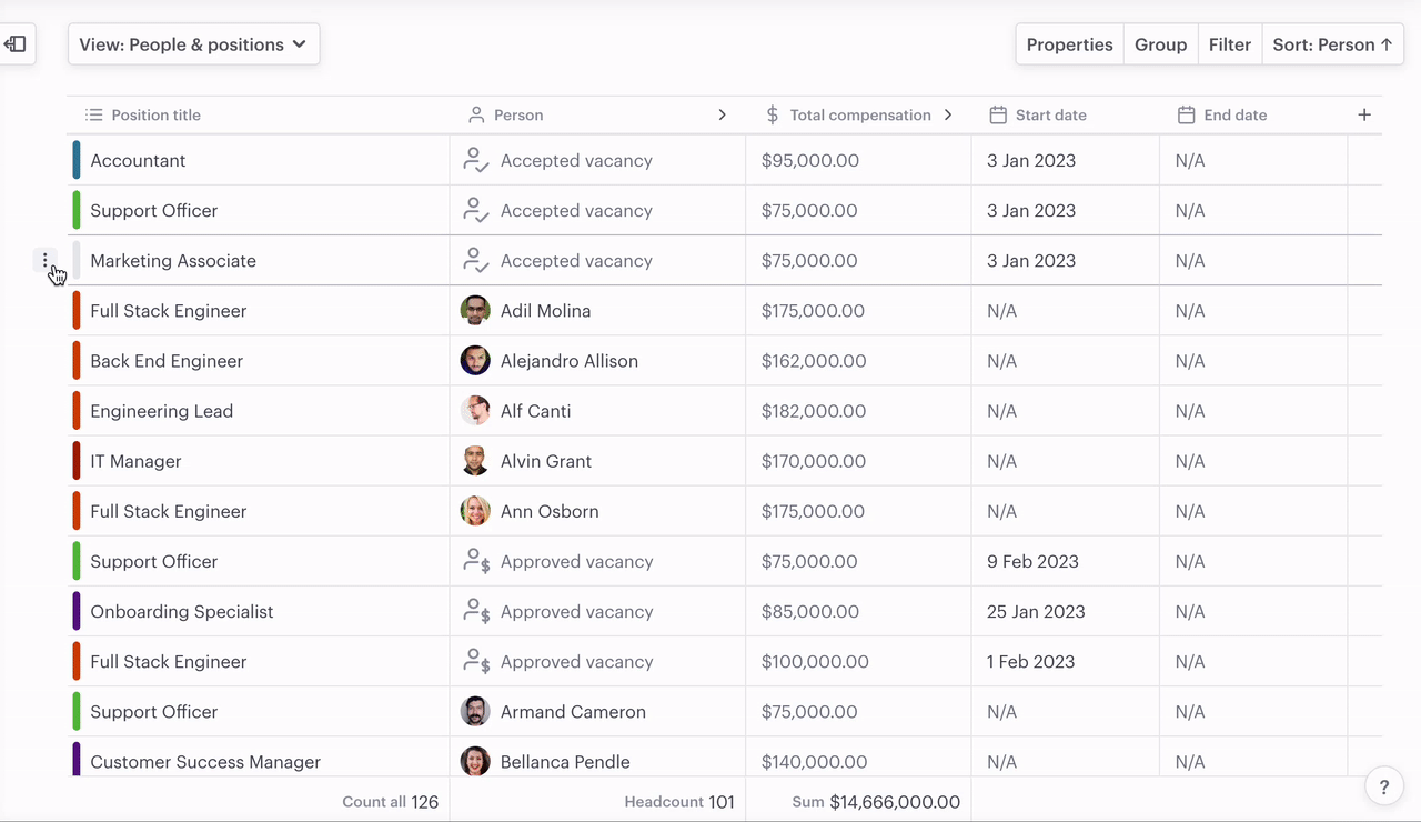
Color a position using the people & positions table
- Click the ellipsis to left of the position
- Select "Change color"
- Choose a color
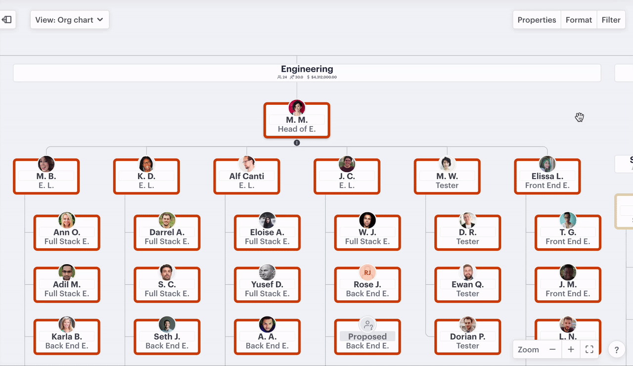
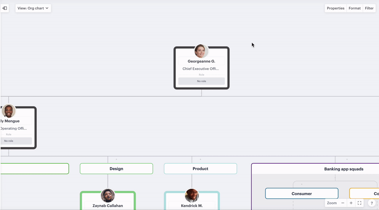
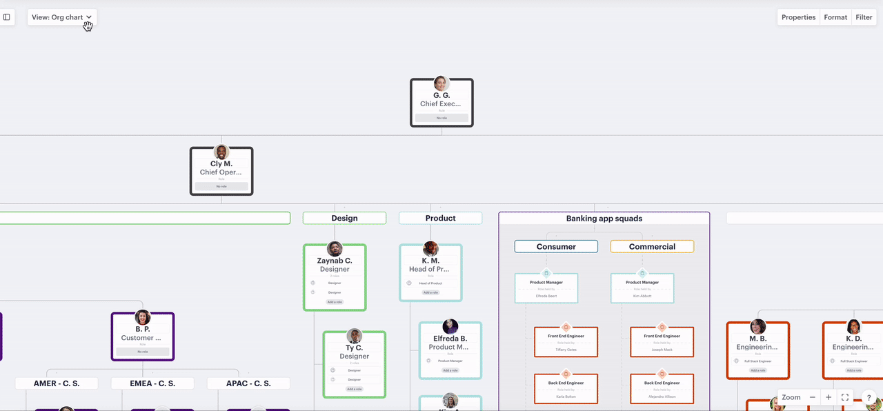
Color a branch of your org chart
- Hover just above or below a position
- Click "more"
- Select "color all below"

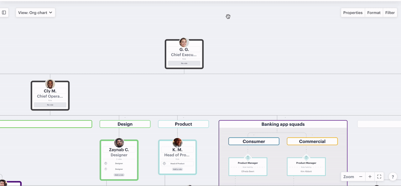
Color a group
- Click the ellipsis on the right-hand side of the label
- Select "color label"
- Choose a color
Edit your color settings
We give you the flexibility to select a set of colors that work for you, or if you want to have total control, set each color individually.
In this section:
Change your palette
- Click the ellipsis on the position
- Select "color"
- Clicking the arrow at the bottom of the color panel
- Select "swap palette"
Only one palette can be used at a time in any scenario.
Set your own colors
If you're not a fan of our color palettes or your organization uses pre-defined colors for teams or departments then you can use hex codes to make the palette your own.
- Click the ellipsis on the position
- Select "color"
- Click the hex code in the bottom right
- Input your own hex color
Use color to view compensation and headcount by department
Adding color to your org chart, of course, makes it pop but it can prove much more helpful. By renaming your colors to match your organization's teams, departments, functions, or any category that matters, you can then group them on your forecast sheet to give you a clearer picture of how much each is costing, their headcount, and FTE. Grouping by color on people and positions table will show each group and its members including any data that's been added for each person.
Steps:
- Rename your colors
- Apply colors across your organization to categorize it
- Group by colors on the forecast sheet
- Group by colors on the people and position table
1. Rename your colors
Rename colors using the org chart
- Click the ellipsis on, directly below, or directly above a position
- Select "color"
- Click where the color shows in the bottom left e.g. "Colour 1"
- Type in the new name and hit return or enter
Rename colors using the forecast sheet
- Change view to "forecast sheet"
- Click group menu
- Select "color"
- Double click any field in the "color" column
- Enter the new name and hit return or enter
Rename colors using the people & positions table
- Change view to "people & positions"
- Ensure color is "on" - click properties, toggle "color" to "on"
- Click on any field in the "color" column
- Click where the color shows in the bottom left e.g. "Colour 1"
- Type in the new name and hit return or enter
-gif.gif)
2. Apply colors across your organization to categorize it
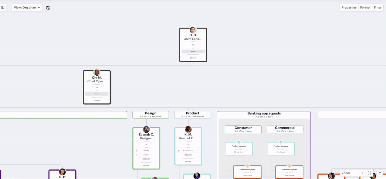
To break your org chart down by the categories you have applied you simply need to color positions either by coloring branches in bulk or coloring individual positions.
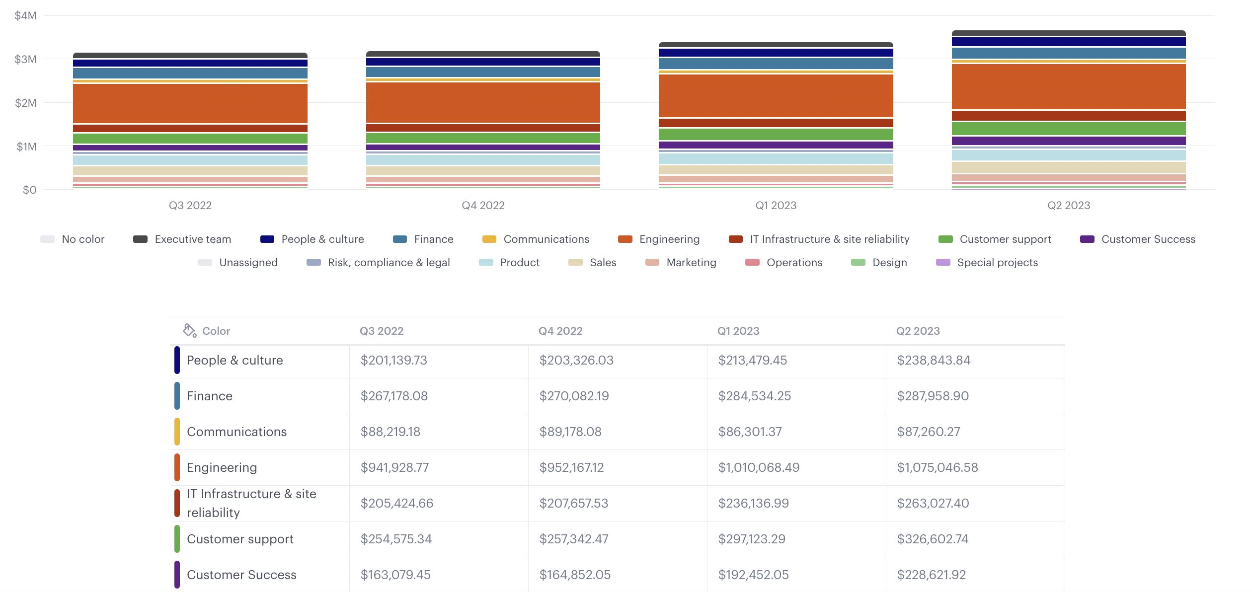
3. Group by colors on the forecast sheet
If you have renamed your colors to the teams, departments, or groups in your organization you can group them on the forecast sheet to get a view of each group's compensation total, headcount, or FTE.
Steps:
- Click the "view" dropdown near the top left and select "forecast sheet"
- Click the "group" menu and select "color" to see data by department

Once color has been grouped on the forecast sheet you can use "data" to view compensation or FTE, "filter" to view just certain criteria e.g. just vacancies, and "scale" to view the information by different time dimensions.
4. Group by colors on the people and position table
To get a view of your categories as a list change the view to "people & positions" then click group and select color. This will show all of your categories and will give you totals for each one for compensation, headcount and FTE.
Steps:
- Click the "view" dropdown near the top left and select "people & positions"
- Click "group" menu near the top right and select "color"
If you're going through workforce planning and want to view a list of your vacant positions by team or department, after following the steps above, click the filter menu and select only vacancies.