
Features:
- Generate your current organizational structure & data
- Create groups to segment your org chart
- Share to collaborate with other stakeholders
- Copy your "current state" to start scenario planning
- Apply color to positions to show proposed changes
- Use end dates to show the progression of changes
- Reduce hours for positions using FTE (Effort)
- View the Forecast sheet to see headcount and compensation changes
- Access scenario history to view earlier versions
- Compare and select the right scenario
- Export to share a final version
1. Generate your current organizational structure & data
Before you and others involved in the process start working on different proposed scenarios for what the organization might look like after a reduction, it's important that you have the current version of your organization and the most accurate data to make informed decisions.
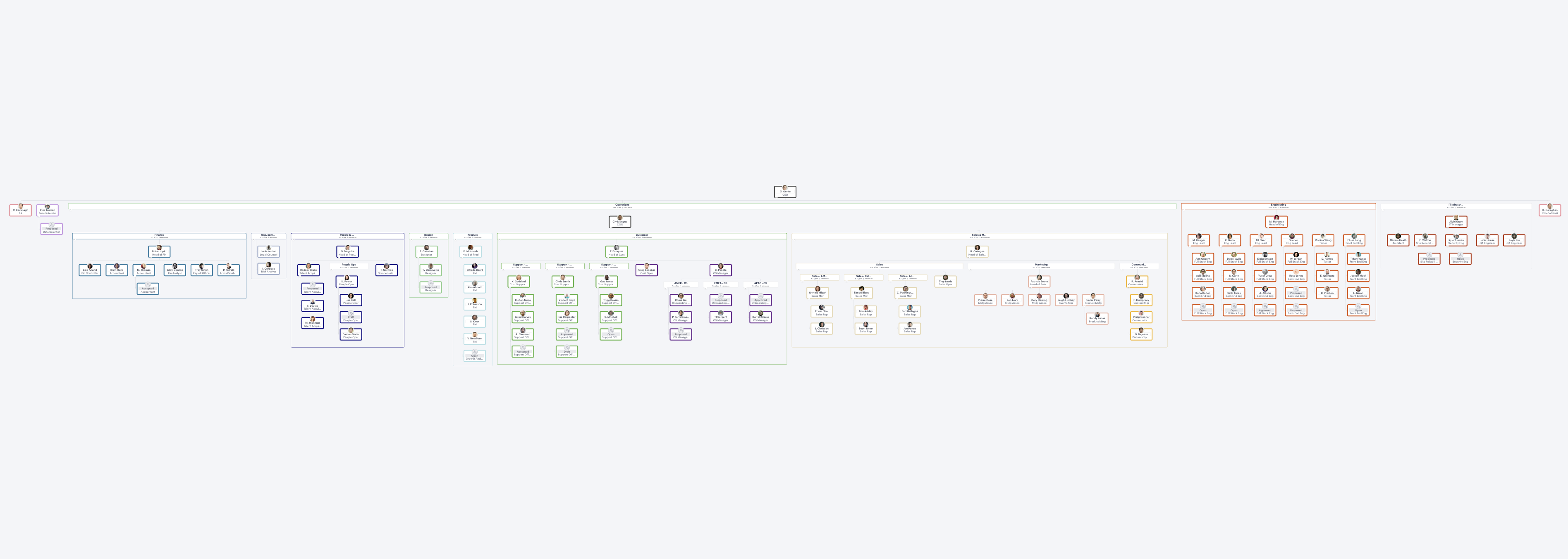
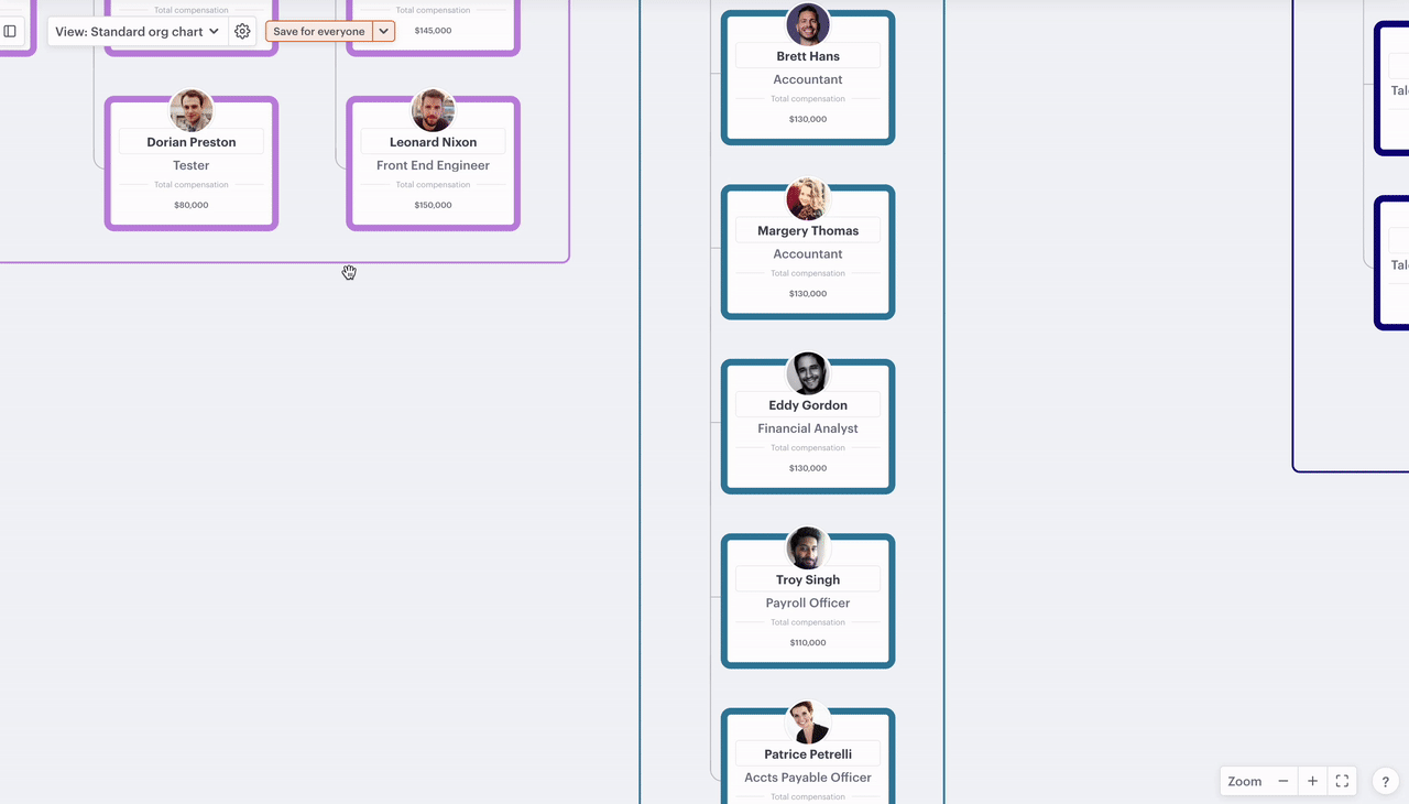
Current state organizational chart
You can import your org chart easily using our CSV import process or if your HRIS or Payroll System is among our integrations.
Read our guide for creating your current state org chart here.
Recommended data to include
Several pieces of data from Functionly's standard fields will prove valuable during this process, and anything that may be specific to your organization can also be added using custom text properties. Below are the fields we recommend importing to provide intelligence before doing a workforce reduction.
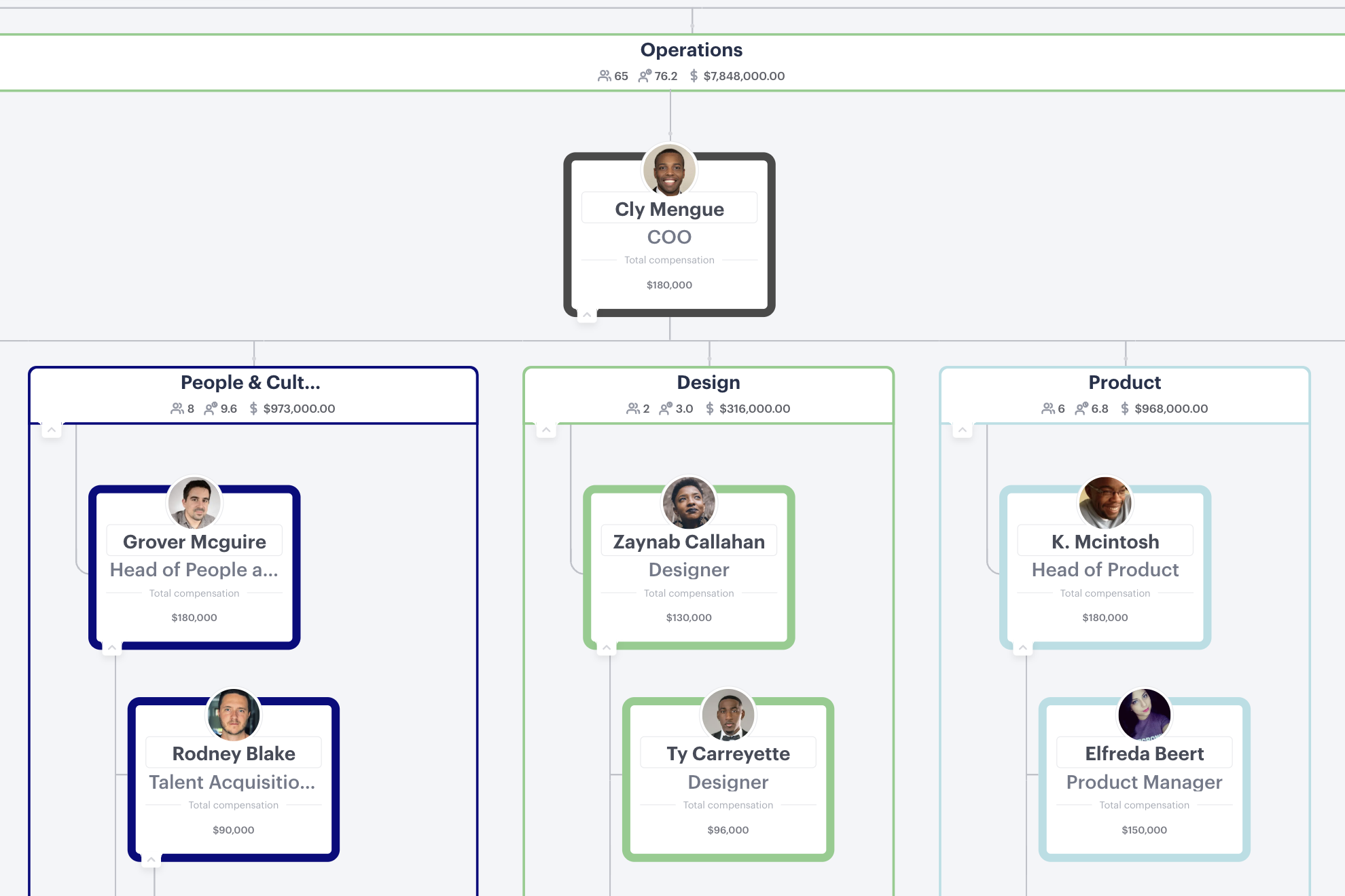
Compensation
Importing compensation will mean that as you draft proposed changes to your organization, you can see the financial impact of those changes through features like group calculations, forecast sheet, and people & positions table.
Only users added to a scenario as an owner or compensation editor can see compensation. Basic editors and those with "view only" access, including share links, won't see compensation for the scenario.
Start date
Including start dates in your data will allow you to determine years of service for people, which may be a factor when looking at redundancies.
On your people & positions table, you can first group by manager, position titles, or different custom properties as defined by you, then sort that data by start date to get a picture of the impact of different proposals.
Custom properties
Perhaps you're planning on making more changes to a particular office and need to be able to view "location", maybe you have identified a particular "product line" within your organization, or maybe there are diversity criteria you have to adhere to. Whatever the data, if it isn't in our existing data, you can add it as a custom property in bulk for everyone in your organization or add manually position-by-position.
2. Create groups to segment your org chart
Adding groups makes it easier to quickly identify different parts of your organization, whether by functional area, team, or a particular product line. In addition to helping identification, adding groups will allow you and others to gain insight into headcount and compensation for those specific areas.
Learn how to add groups 👥 and maximize them with features like group calculations.
3. Share with other stakeholders
Bringing others into the process at an early stage is important to ensure that decision-making isn't happening in a vacuum. Sharing your scenario with other key stakeholders is the best way to ensure that decision-makers are seeing exactly what you see. However, you have the flexibility to limit how much control and access people have.
Before you have shared a scenario with others, is a good time to take a copy as a backup, should you need it.
In this section:
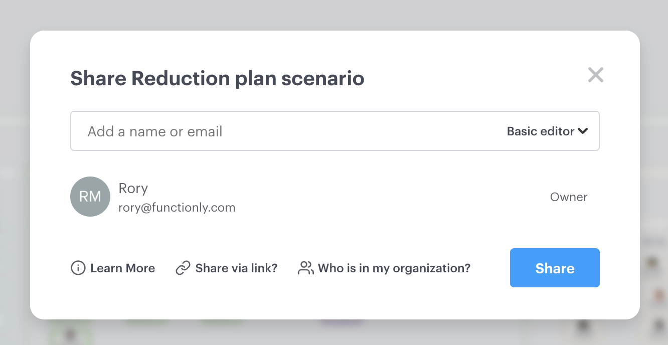
a. Share to collaborate
Inviting others to Functionly and sharing a scenario with them directly will give them the ability to make their own proposed changes. You can give them access to just view, make structural changes, or view and change compensation.
Learn how to share a scenario with another user and understand what the different access levels mean.
b. Share a view-only link
Sharing a link is a great way to provide access to stakeholders who don't have time to set up an account but require input on the process. Links can be password-protected, set to expire, and can have a default view set so that viewers see what you want them to see straight away.
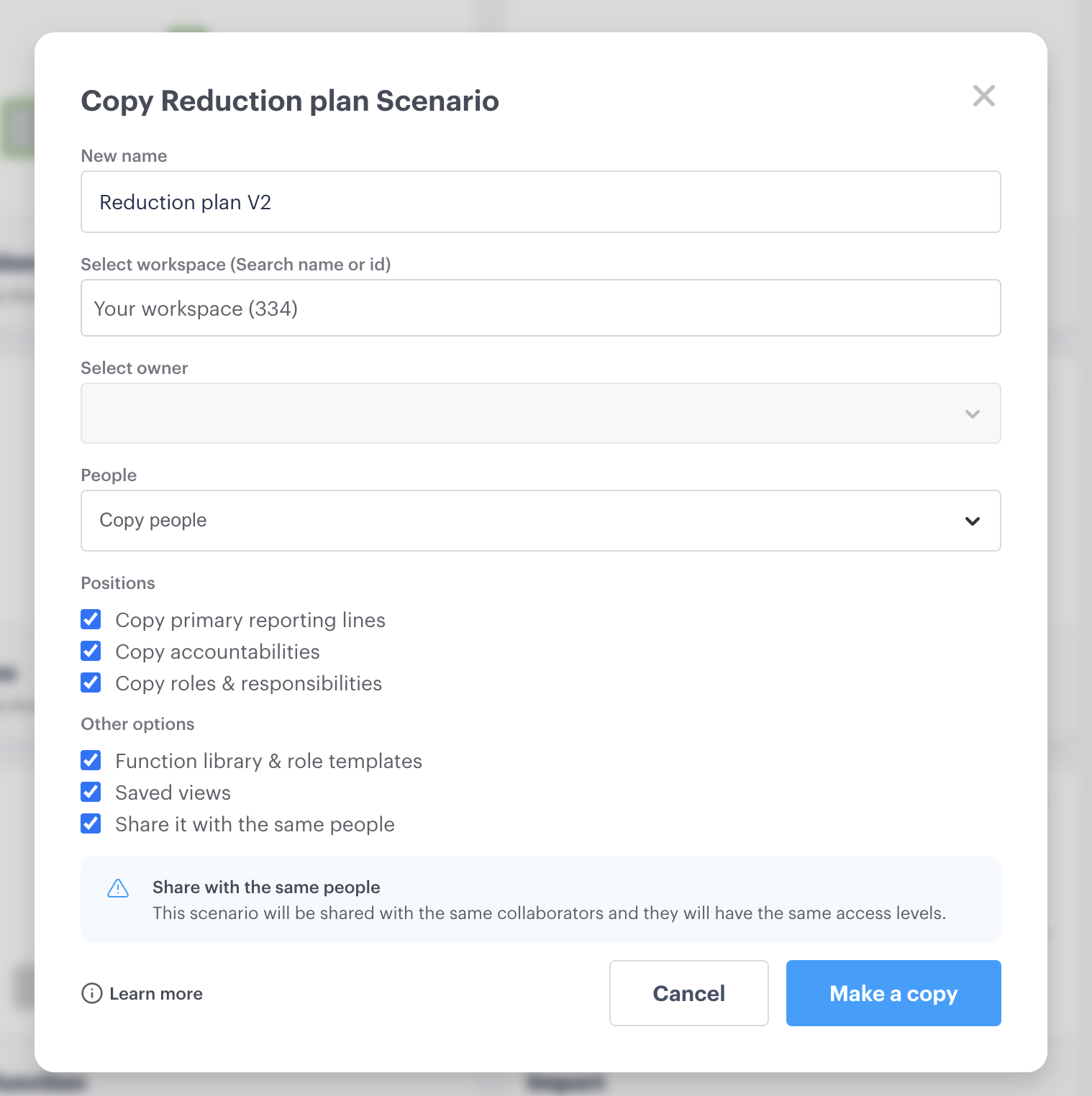
4. Copy your "current state" to start scenario planning
Taking copies of your current state scenario will allow you and others to create different versions of what your organization will look like once the process is complete, taking different approaches in each. For example, you may want to understand what a 5% reduction in headcount looks like compared to a 7% reduction, both visually and also as it relates to total compensation.
Here's more information on how to copy scenarios
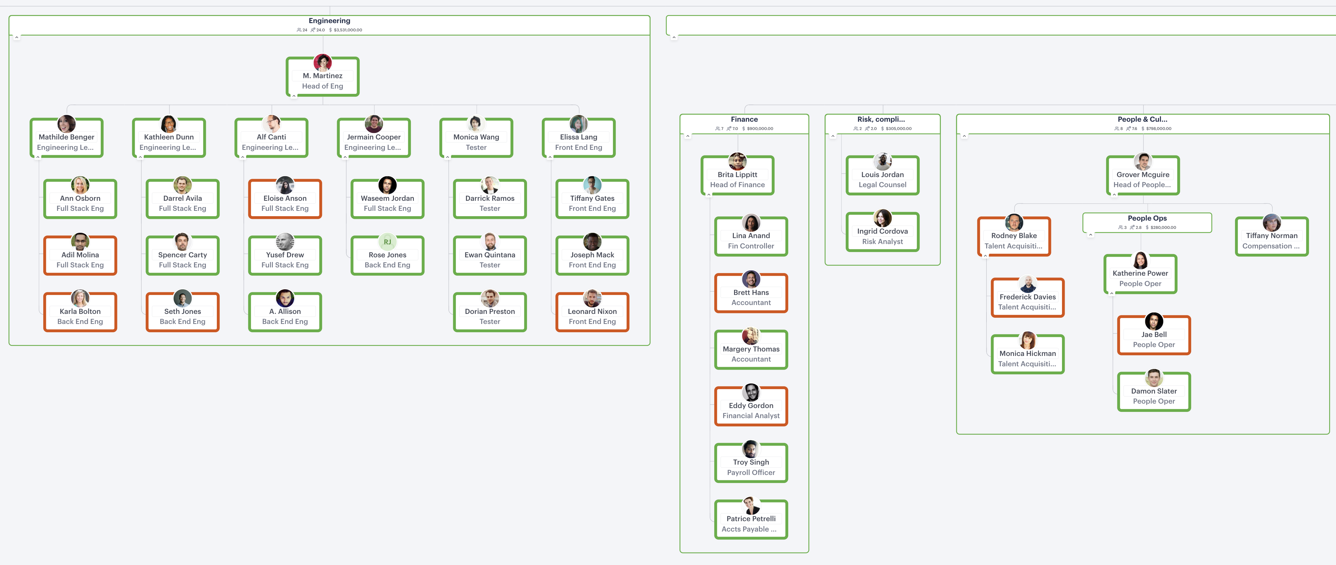
5. Apply color to positions to show proposed changes
Applying color to positions or groups of positions can communicate certain criteria e.g. green for a position to be retained, red for one that would be redundant in that particular scenario. You can also provide a key to others viewing your scenario to show what you're trying to communicate about those positions.
Alternatively, you can color positions by team and then see the rate of change in headcount and compensation across different teams, using the forecast sheet.
Any color applied to positions on the organizational chart can then be grouped on the "people & positions" view or "forecast sheet" so that you can see the total headcount, or compensation, for positions that have been allocated with a certain color.
Learn how to use color in your scenario including using color to segment headcount and compensation.
6. Use end dates to show progression of positions removal
As you go through the process, proposing end dates for positions in your draft scenarios will allow you to see how those changes are going to impact headcount and compensation over time using the forecast sheet. In addition to this, once you have agreed on the final structure, you can export your scenario, including its end dates, to CSV.
Steps to add end dates:
- Click "View" near the top left
- Select "People & positions"
- Select the "Properties" menu
- Ensure "End date" is toggled to "on"
- Click on the "End date" field for any position on the table
- Input a proposed date and hit enter or return
7. Reduce hours for positions using FTE (Effort)
If your strategy includes reducing hours for some people, then changes to their position's FTE (Effort) will reflect in their compensation. Any position with an FTE of 1 represents someone full-time, so if, for example, you would like to get an idea of what the organization might look like with some positions changed to four days a week, you can change their FTE to 0.8, three days a week to 0.6, etc.
Changes will also reflect in any group's total FTE and total compensation when group calculations are switched on as well as the organization's total compensation on the "people & positions" view and "forecast sheet".
Using the org chart:
- Click the cog ⚙️ next to the "view" menu near the top left
- Hover over "properties"
- Toggle "Full time equivalent (Effort)" to "on"
- Click the "FTE (Effort)" field on any position
- Input a number e.g. 0.8 for four days a week
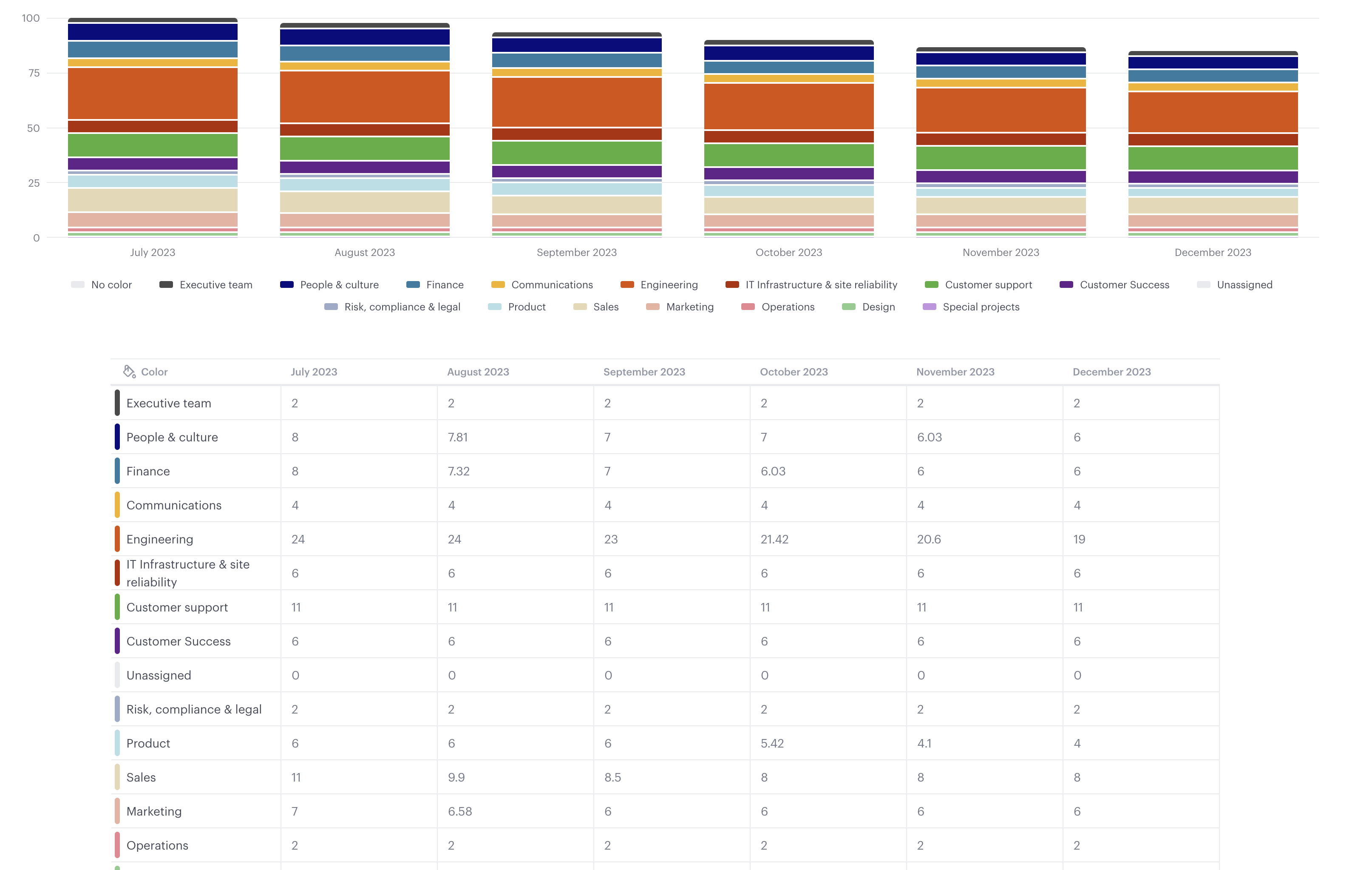
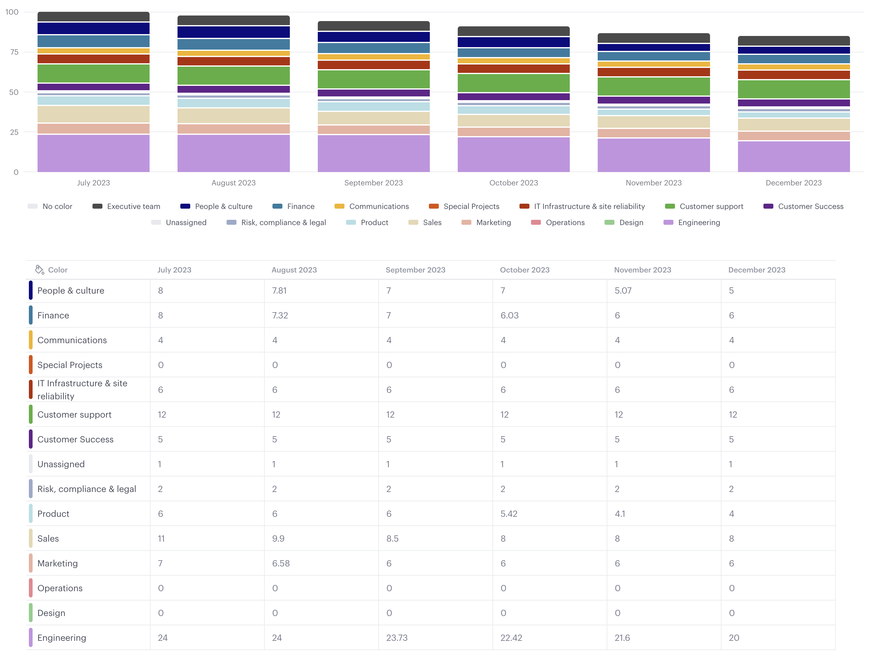
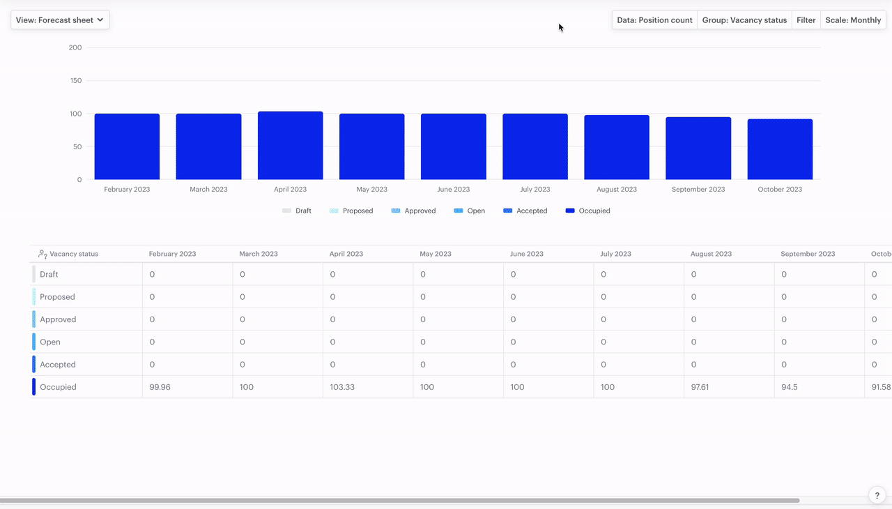
8. Forecast to see the impact
The forecast sheet allows you to view proposed changes to headcount and compensation over time. The data can be viewed across the organization as a whole, for particular groups, or using color if you have applied them to denote certain criteria.
In this section:
View headcount over time
- Click the "view" dropdown near the top left
- Select "forecast sheet"
- Click the "data" menu
- Select "headcount"
- Click "Group" menu and select your chosen grouping
- Click "scale" and select your chosen time dimensions
"Headcount" shows the number of positions that are occupied by people, and "position count" shows all positions, including those that are vacant. "Effort (FTE)" shows the total full-time equivalent.
View compensation over time
- Click the "view" dropdown near the top left
- Select "forecast sheet"
- Click the "data" menu
- Select "compensation"
- Click "Group" menu and select your chosen grouping
- Click "scale" and select your chosen time dimensions
Any visualization of data you make on the forecast sheet can be exported to CSV by clicking the "export" button in the top right and selecting "Download CSV".
9. Access scenario history to view earlier versions
As you make a lot of changes to your scenario, to see how the organization might look with different strategies applied, you may realize that an earlier version was better. You can now easily access the history for any scenario if this is the case.
10. Compare and select the right scenario
It's likely that you, and other stakeholders in the process, will have created multiple proposed scenarios for what your organization should look like in the future. As such, it's important to be able to compare those scenarios both from a structural and data perspective, for details like headcount and compensation.
Compare structure, compensation and headcount
If you have added groups and enabled group calculations, you can compare headcount and compensation as well as looking at the structure by simply loading them side by side, or by exporting the different versions.
Compare data (compensation, headcount & end dates)
To compare the data such as headcount, end dates, or compensation by team or for the whole organization, you can use the menus in the top right of the "people & positions" table to get the view that you're looking for then export to CSV
11. Export to share a final version
Once you have agreed upon the final structure, post-reduction, exporting to CSV will provide you with the staging of changes to the organization, and exporting to a visual format can show what the final version of the organization will look like.
Export with end dates for your leavers
- Click "export" in the top right
- Select "Download CSV"
Any order, grouping, or properties you set on the "people & positions" view will be reflected when you export to CSV.
Export your org structure with compensation and group calculations
- Ensure you are on org chart view
- Click the cog ⚙️ icon next to the "view menu"
- Hover over "properties"
- Toggle "compensation" and "group calculations" to "on"
- Click "export" near the top right
- Select "download" in your chosen visual format
Want help getting set up or utilizing some of these features? Contact support using our contact us page or email support@functionly.com