
The forecast sheet is designed to provide future projections for key pieces of organizational data. By selecting a few inputs, you can see information like headcount and compensation broken down by different time dimensions and employment statuses, to name just a few criteria.
Contents:
1. Data
The data menu provides the primary inputs for what piece of information you want to gain insight on. Below are the different options you can explore.
In this section:
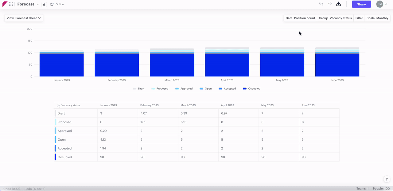
Position count
The number of positions including positions that are currently vacant as well as occupied positions.
Headcount
The number of positions that are currently occupied by a person i.e. vacancies, are not included in the count.
Effort (FTE)
Viewing the effort or full-time equivalent in your organization will give you a view of cumulative FTE. Each full-time position counts as 1 effort, so as an example, if you have a 100-person organization in which everyone is full-time, the cumulative effort will be 100. If each position is only four days per week then their effort will be 0.8 and the cumulative effort for a 100-person organization will be 80.
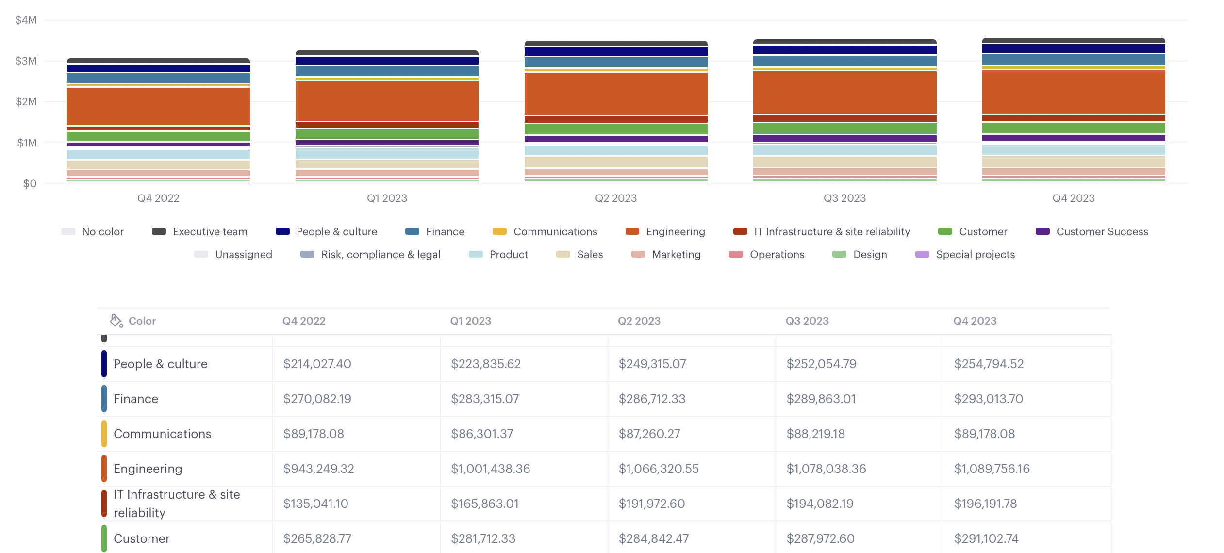
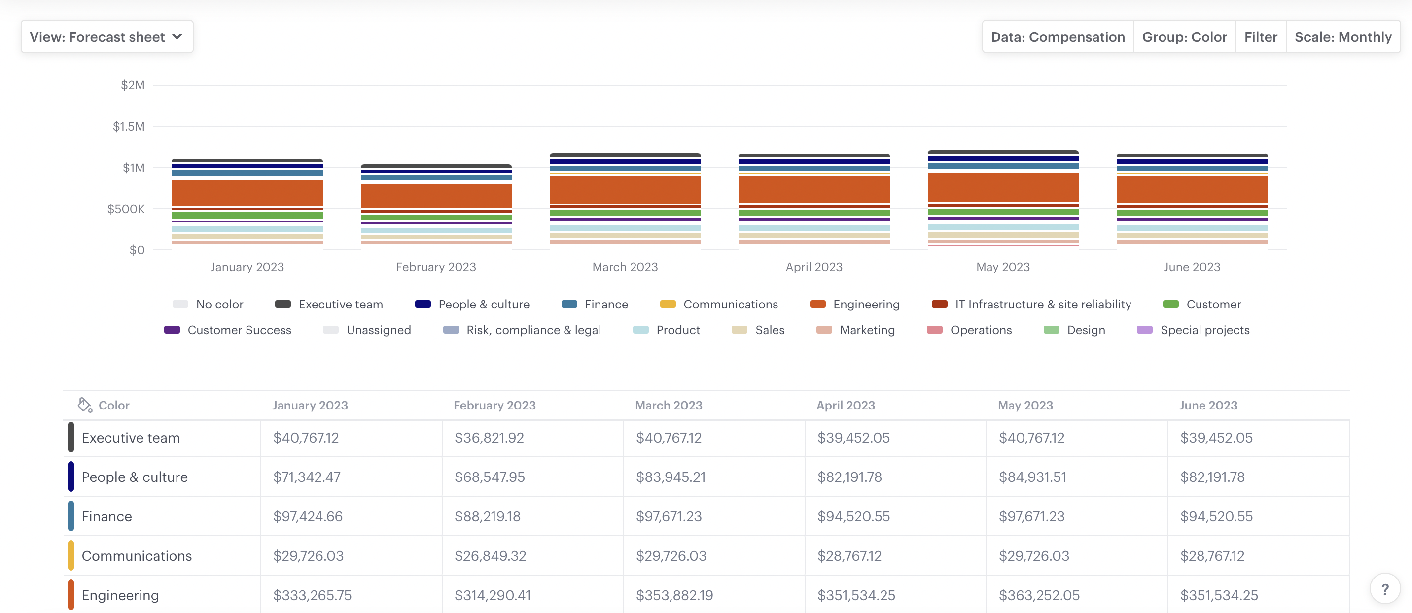
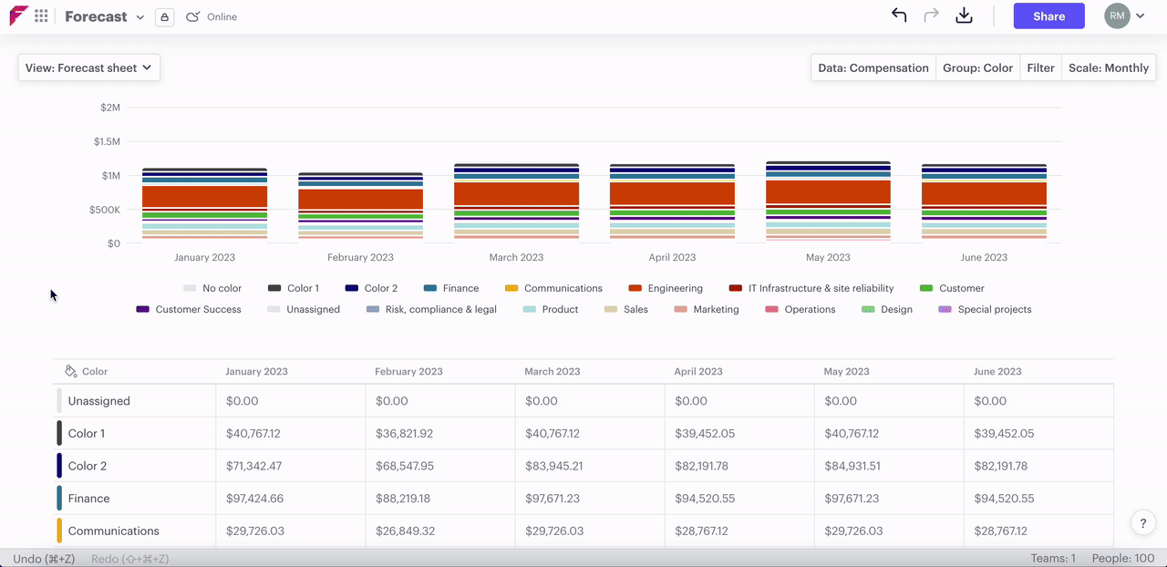
Compensation
Compensation is exactly as it sounds, it shows the compensation total for groups of positions.
Hours worked
Hours worked shows the cumulative hours worked for all positions in a particular grouping. If you have set a position's compensation to hourly then you can dictate what the total weekly hours will be for it. If it's set to annual then by default you will see that it's 37 hours per week.
Only primary roles are reflected in data on the forecast sheet, not secondary (dotted-line) reports. For example, if a person from your marketing team primarily reports to the head of marketing but they have a dotted line to the head of sales, then their headcount, FTE, compensation, and hours worked will be reflected in data for marketing.
2. Group
In this section:
Budget status
This shows data broken down by the level of budgetary commitment for positions in your organization, and there are three statuses:
1. Uncommitted
These are positions that are currently vacant with a vacancy status of draft, or proposed.
2. Committed
These are positions that are currently vacant with a vacancy status of approved, open, or accepted.
3. Actual
These are positions that are currently occupied by a person in your organization.
Vacancy status
Grouping by vacancy status will allow you to get a picture of the total number of positions you have at the various stages of the hiring process.
Compensation type
Grouping by compensation type will give you a breakdown of positions that are paid annually and hourly.
Color
If you have applied color to your positions, then you can see your data broken down by these colors. You can also rename the colors on the forecast view by clicking on any color field on the table. This allows you to provide a key to what the colors mean for other people viewing the scenario and carries over to the color palette across the scenario; for the org chart, and people and positions view.
3. Filter
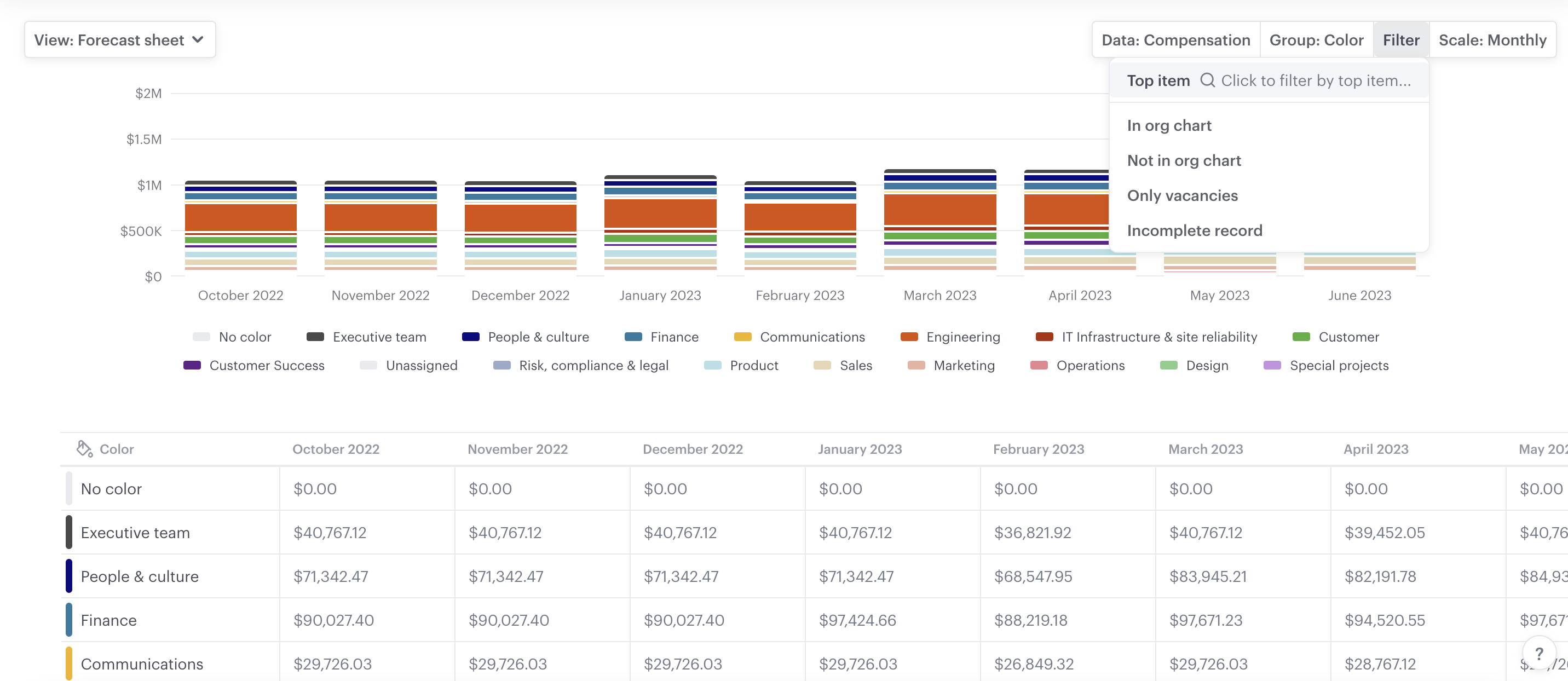
In this section:
Top item
As with the org chart, top item allows you to view everyone in your organization from a certain point down, including positions or groups. For example, if you wanted to just see data for all positions below your head of sales and marketing then you can type their name or position title in. Or, if you have added groups for your functional areas and you want to see your engineering organization then you can select "top item" and search for the "engineering" boundary or label.
In org chart
Exactly as it sounds, this allows you to include data exclusively for positions that are currently in your org chart.
Not in org chart
Not in org chart shows data for positions that have been created in your scenario but are not added to the org chart. You can see a list of people who are not in the org chart in the left-hand menu but only people with a position title in the left-hand menu will be counted in this data.
Only vacancies
Again, another that is exactly as it sounds, it will only show data for vacant positions in your org chart.
Grouping by color and filtering to show only vacancies will allow you to see position count, compensation, or effort (FTE) for vacancies in those different areas depending on what your colors represent. Learn how to use color to identify your different functional areas.
4. Scale
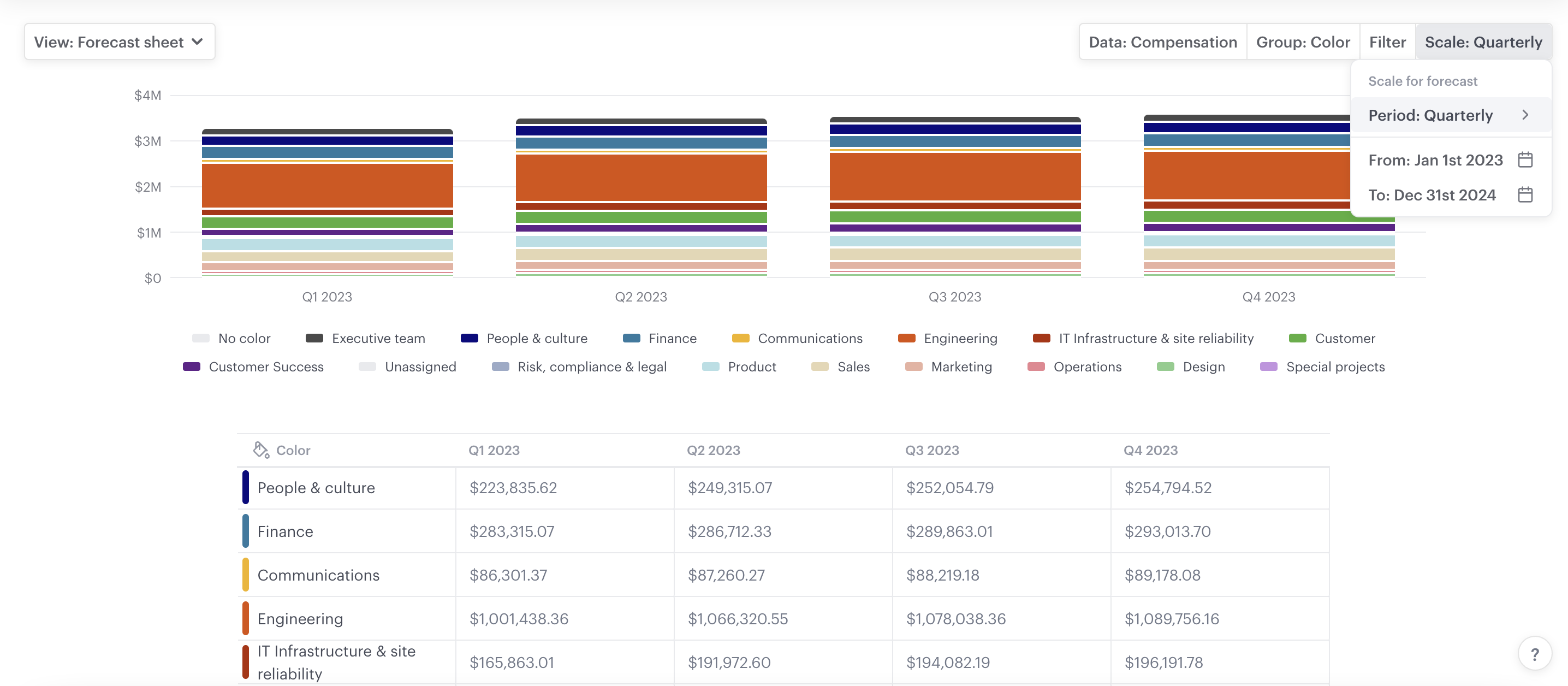
In this section:
Period
Displays the period of time each increment of data reflects, and can be set to weekly, monthly, quarterly, or annually.
From
The start date for the time scale you would like to view.
To
The end date for the time scale you would like to view.
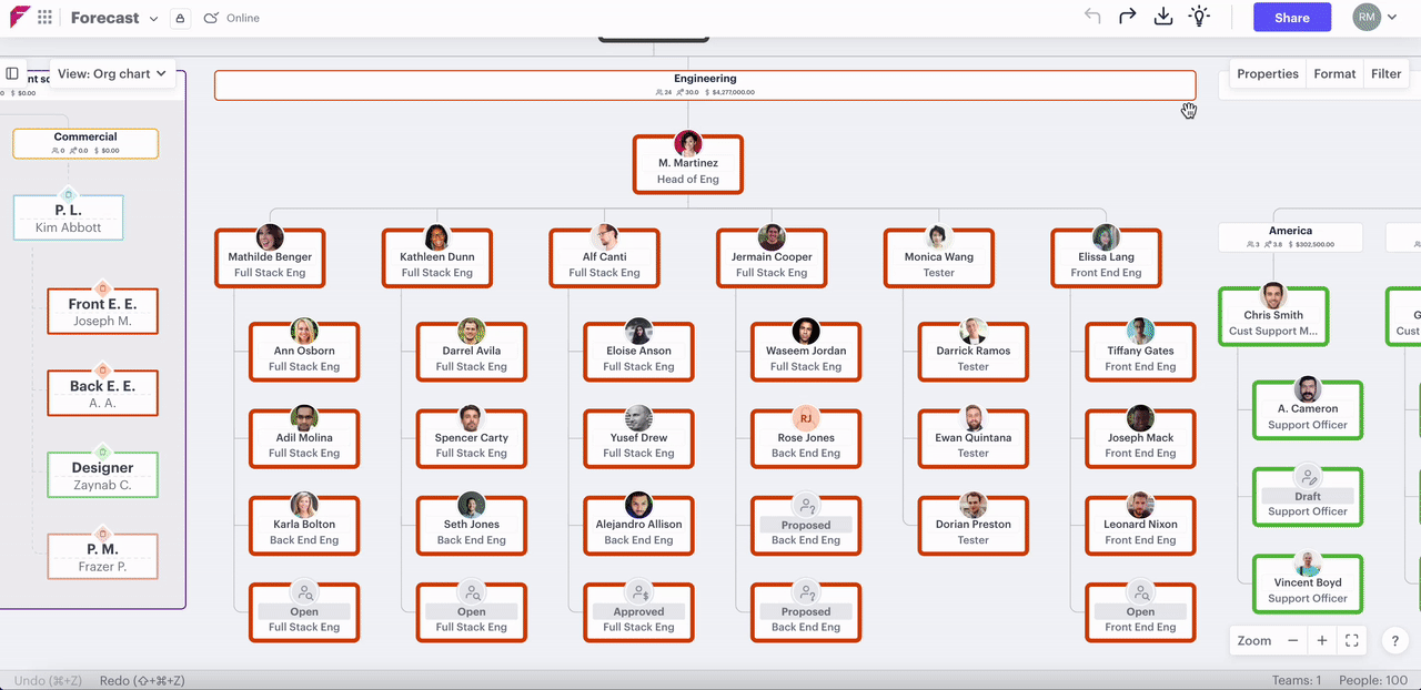
5. View forecast data on the organizational chart
In this section:
- See a forecast summary on the organizational chart
- See a forecast summary for groups on the organizational chart
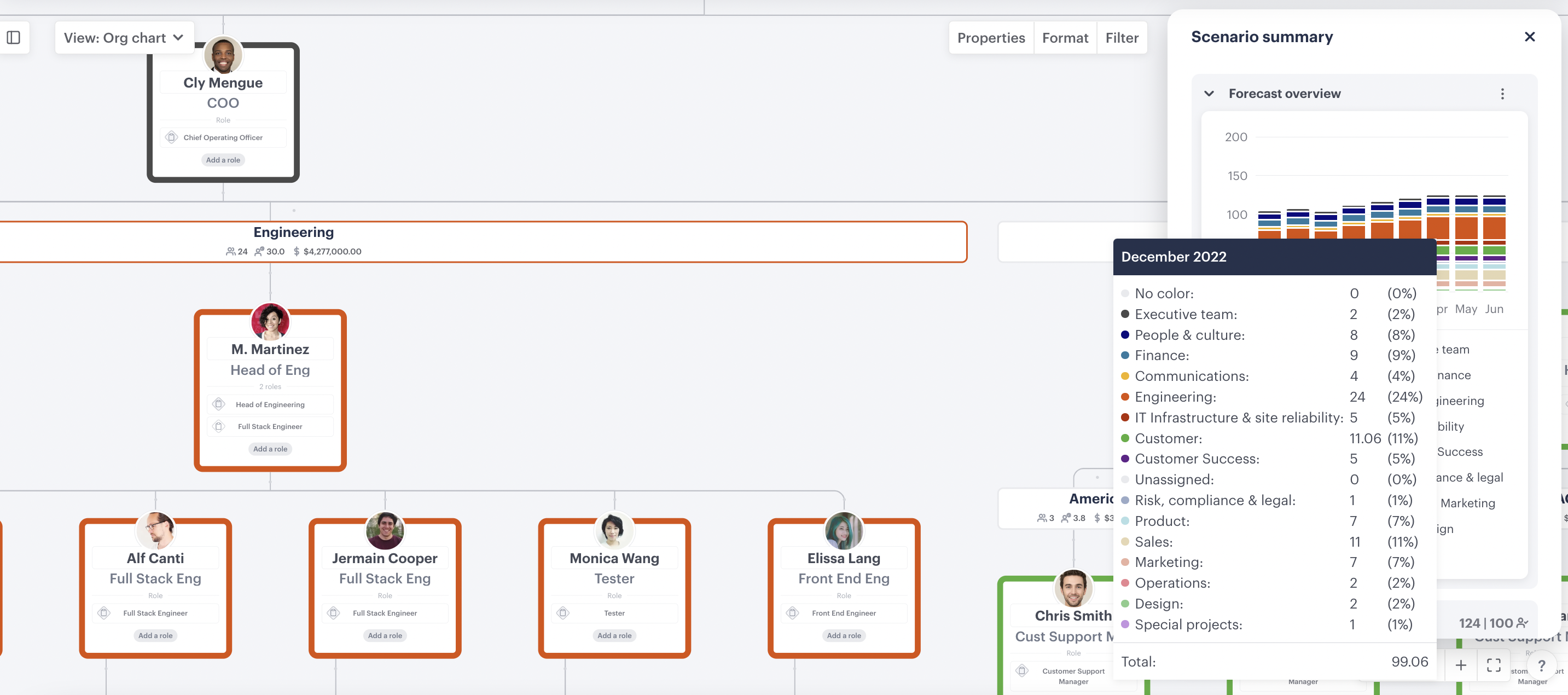
See a forecast summary on the organizational chart
When viewing the org chart you can view a snapshot of the forecast view by clicking the summary icon 💡 in the top right and change the inputs using the ellipsis to see the data you want.
See a forecast summary for groups on the organizational chart
If you want to see a forecast summary for any of your groups, whether they are teams, functional areas, or pods, you can click the ellipsis on the top right of the group's label and select "💡 View summary". This will give you the forecast data that's specific to that particular group.
6. Export data from the forecast sheet
If you want to share insights from the forecast sheet with colleagues who are not in Functionly, you can export the sheet to CSV once you have the data ordered as you want it to appear. Simply click the export button in the top right or use the scenario menu dropdown and select "download CSV".
Have questions or feedback about the forecast sheet? Get in touch using our contact us page or emailing support@functionly.com