

Contents:
Trying to create matrix or cross-functional teams? Check out our article on how to use secondary reporting lines to visualize your pods, squads, or tribes together with groups.
1. Add and delete groups

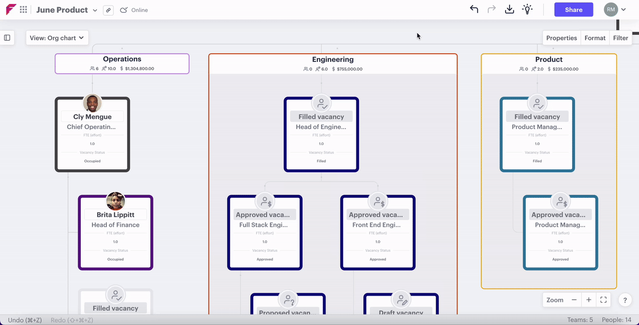
There are three group styles that can be added to your org chart: boundaries, labels, and teams. A boundary wraps around groups of positions, a label sits as a named banner above a position or groups of positions, and a team contains a group of positions that has no hierarchy. Below, we lay out the ways to add and remove them.
In this section:
- Add a group over a position
- Add a group beside a position
- Add a team
- Delete a label
- Delete a whole group
Add a label or boundary group above a position
Steps:
- Hover above any position
- Click the grid symbol that appears
- Select "New group boundary" or "New group label"

Add a group beside a position
To add a group beside a position or branch of positions:
- Hover over the plus symbol that appears next to a postion
- Click the ellipsis (three dots) below the plus
- Select "Add a group boundary" or "Add a group label"
Once the group has been created, you can start dragging and dropping positions under it.
![]()
Add a team
A team is a collection of positions that has no hierarchy and, as such, they can't have subordinate positions reporting into them, so must sit at the bottom of a reporting branch. They are ideal for showing cross-functional and matrix teams.
Steps for adding a team:
- Hover over a position
- Click the ellipsis next to it
- Select "New team"
- You can either click to add position or drag and drop positions into the team

Teams must be at the bottom of the hierarchy.
Delete a label
To remove a group and leave the positions in place on your org chart:
- Click the ellipsis on the right-hand side of the heading
- Select "Delete label"

Delete a whole group as well as the positions inside
To remove a group as well as its positions from the org chart:
- Click the ellipsis on the right-hand side of the heading
- Select "Delete whole group"

2. Group style
In this section:
Rename a group
To rename a group:
- Click on the label to open the group in the right-hand menu
- Click the name of the group
- Type in the new name
- Hit enter or return

OR double-click the name on the group

Color a group or label
To color a group or label:
- Click on the ellipsis (three dots) icon on the right-hand side of the group
- Click "color"
- Select your preferred color.

Change group style
If you would like to change a boundary to a label or vice versa:
- Click the ellipsis on the right-hand side of the heading
- Hover over "Style"
- Select "Label only" or "Show boundary"

View a list of the group contents
To see a list of the positions and sub-groups in a group, click on the white space on its label.

3. Moving groups and changing their contents
In this section:
Move a group with its positions
Steps:
- Hover above the group until the hand or directional icon appears
- Click and hold
- Drag and drop it where you would like it to be located

Move a group without its positions
Steps:
- Press and hold "control" on PC or "command" on Mac
- Click and hold the label for the group
- Drag and drop the group
-gif.gif?width=670&height=371&name=Fnly_move_group%20(1)-gif.gif)
Move a position
To add existing positions into a group:
- Click and hold a position
- Drag and drop it inside the boundary or under a label

To add a full reporting line to a group or label then simply drag and drop the person at the top of the reporting tree.
Add groups inside another group
To further segment a group by adding more groups below:
- Hover your mouse cursor above the position at the top of the group
- Click the grid icon
- Select "New group label" or "New group boundary"

If you have other groups elsewhere on your org chart you can drag these inside another group along with any positions that are contained within.
To add a group around another group hover over the top click the plus symbol, hover over "New group", click "Boundary" or "Label".
4. Get more from groups
In this section:
Visualize group calculations
If you want to understand the total compensation, headcount, or full-time equivalent for any group, you can add them visually at the top.
Using "view settings":
- Click the "view settings" menu
- Hover over the "properties" menu
- Toggle "Total headcount," "full-time equivalent," or "compensation" to "on"

Using the right-hand menu:
- Click on the top of the group or the ellipsis
- Click the ellipsis near the top next to "Calculations"
- Toggle your chosen calculation to "on"

Set goals for groups
Group goals allow you to track the headcount, FTE, and compensation targets for each group to insure they adhere to your organization's operating model. In addition to this, they also allow you to do your org design on a group first basis, so you can take a macro approach rather than getting into the nuts and bolts straightaway.
Set goals using the group
- Click any calculation at the top of the group
- Select the "Set goal" menu
- Choose "At least," "At most," or "Between"
- Input the value for your goal and hit enter or return

Set goals using the right-hand menu
- Click the top of any group
- Click "Total headcount," "Total FTE," or "Total compensation" in the right-hand menu
- Select the goal menu
- Choose your parameter
- Input values and hit enter or return

Group summary
Using the ellipsis menu on the top right of any group you can "view summary" giving you a quick snapshot in the summary sidebar of position count, headcount, effort, compensation, or hours worked. This data can then be grouped by different parameters and viewed through different time dimensions.
Search for a group
If you have a large org chart with lots of groups then you can easily search for a particular group using the "top item" search function in your filter menu.
Steps:
- Click the "view settings" menu
- Select "Top Item 🔍"
- Search for the name of the group
- Click on it when it appears in the list

Want help creating your matrix or cross-functional teams? Get in contact with support@functionly.com or use our contact us page.