


If you want your organization to operate like a finely tuned machine, it is critical that everyone understands their role within the company. This requirement applies to entry-level staff members, mid-level managers, and senior executives.
When everyone is on the same page regarding their responsibilities and the manner in which they are expected to contribute, the entire organization benefits. Your staff will reap the rewards as well, as they will experience better morale and an improved ability to collaborate.
If you’re defining your organizational hierarchy, visual mediums are one of the most effective tools at your disposal. Specifically, you should consider crafting organizational charts, more often referred to as just “org charts.”
Your company probably has several different software solutions at your disposal that could be used to create org charts, and Microsoft Excel is one of them. Although the spreadsheet software is best known for its ability to process equations and track transactions, it also has organizational chart-making capabilities.
Below, we provide a guide to making org charts in Excel and examine the pros and cons of this platform’s capabilities.
How to Make an Org Chart in Excel
Making org charts in Excel can be quite easy and efficient. To craft an org chart in Excel, simply follow these steps:
1. Create a New Doc and Click SmartArt
First, open up a fresh Excel document so that you can work from the platform’s default settings. From there, select the “SmartArt” button. The button is typically located next to “3D Models,” provided you have not customized your toolbar.
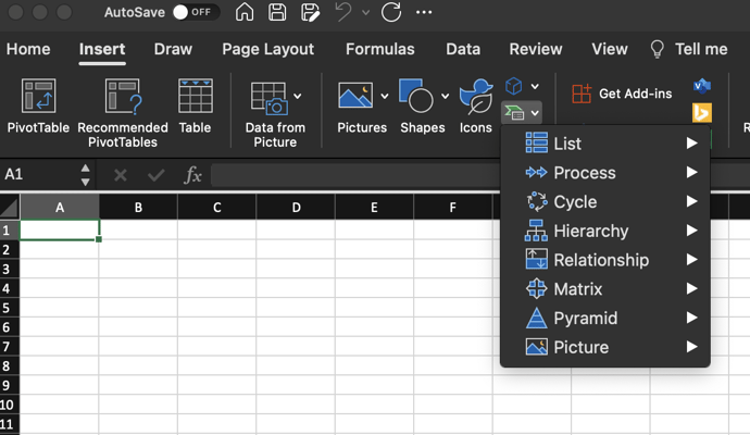 Click the "SmartArt Graphic" icon found on the Insert toolbar.
2. Select Hierarchy Chart
Select Hierarchy ChartAfter you have clicked on SmartArt, a drop-down menu will appear. You will need to hover your cursor over the word “Hierarchy.”
When you do, a fly-out (horizontal) menu will appear. The menu will feature multiple hierarchy charts of varying complexities. Simply click on the chart that best aligns with your organizational structure.
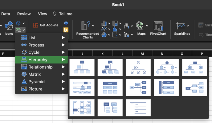 Choose Hierarchy and select a chart style from the fly-out menu.
3. Customize Your Chart
Once your chosen chart has been rendered, you will be able to customize it by adding text to each shape. You can use the SmartArt text box to enter text or type directly into the boxes. If you need to add multiple lines of information, hit enter. Doing so will generate a new bullet point.
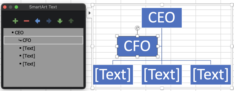 Use the SmartArt Text box to enter text.
4. Expand or Condense the Size of Your Chart
When you hovered over the Hierarchy menu option on step two, you had plenty of org chart options to choose from. However, there is still a good chance that the option you selected had either too many or too few shapes. The good news is that you can easily add or remove shapes to make your chart fit your needs.
To add a shape, first select the existing shape from which you want to add the new shape. Then, from the SmartArt Design toolbar, click the small arrow next to the "Add Shape" icon. Select the appropriate command from the fly-out menu. Your options should include:
- Add Shape After
- Add Shape Before
- Add Shape Above
- Add Shape Below
- Add Assistant
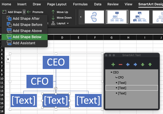 Use the "Add Shape" icon on the SmartArt Design toolbar.
Alternatively, you can click on the “+” symbol to add shapes. The symbol is located to the right of your screen within the SmartArt box.
To remove shapes, you can click on the “-” symbol or select “Remove Shape” from the drop-down menu that populates when you use the “CTRL+Right Click” command mentioned above.
5. Modify or Update Your Chart’s Format
When finalizing your Excel org chart, you will have the option to customize font sizes, shapes, and colors. This work will give your org chart a more personalized appearance that fits your brand’s values, style, and voice.
When customizing your chart, consider incorporating brand colors and your standard font that is used for internal communications.
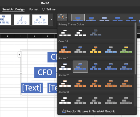 Apply different color themes.
After your org chart is complete, you can go back into the document and make additional formatting changes. To accomplish this, simply select the “Format” tab from the top menu. You can also use SmartArt Design tools to alter the color of shapes in your org chart.
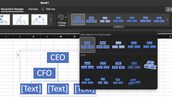 Apply different chart styles.
Pros and Cons of Excel Org Charts
While the Excel platform has undergone several evolutions over the last few decades, the basic functionality of the software has remained relatively unchanged. This simplicity speaks to the versatility and user-friendly nature of the platform. Still, Excel is not without its flaws, especially when viewed through the lens of an org chart creation tool.
We have outlined the advantages and drawbacks of Excel org charts below.
Advantages of Excel Charts
The most notable advantage of creating org charts in Excel is cost. If your organization already has a Microsoft Office business license, then you have access to Excel. You can create org charts in-house without investing in new software.
Additionally, as evidenced by the steps mentioned above, creating org charts in Excel is incredibly easy. Even someone with a cursory familiarity with the platform could create org charts without too much difficulty. As a result, you could avoid the need to outsource the creation of org charts.
Drawbacks of Excel Charts
Of the several drawbacks associated with using Excel org charts, the worst offender is the static nature of the files. Excel org charts have no dynamic features, which makes them unsuitable for use in presentations, internal communications, and onboarding.
Additionally, making significant alterations to Excel org charts is tedious — to say the least. Sure, you can update the font or colors used in your org chart shapes, but that is the extent of Excel’s capabilities.
To Excel or Not?
Excel offers a cost-effective means of creating simple, functional org charts. However, these org charts have limited usefulness. They are not suitable for conducting high-level function mapping, identifying responsibility overlaps or gaps, or allocating accountabilities to managers.
Fortunately, you can accomplish all of those high-level tasks and more using Functionly’s org chart platform. Our dynamic solution can help you improve organizational transparency through responsibility and function mapping while simultaneously ensuring that everyone understands their role within the company.
Functionly even integrates with popular platforms like Slack, Gusto, Intuit Quickbooks, and many others. Sign up for a free 22-day trial and experience the power of Functionly for yourself.
